Tuesday, 27 December 2011

Preliminary task #1

Auxiliary Product #1
 Poster

I have chosen to do a poster for my trailer because I see a lot of posters advertising documentaries around the town in newspapers, magazines and street walls. I need my poster to convey the correct codes and conventions of the punk documentary so...

  • I have chosen to use the same idea at the end where the graffiti starts for my poster
  • This is because I believe it portrays the typical rebellious punk in the 70s/80s
  • I have also chosen to use the colours black and white because it portrays the former picture of the typical punk wearing black (leather and black hair etc) and it also is an attempt to portray the oldness of the band
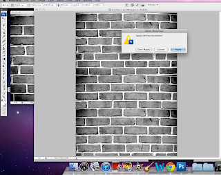
Here are some print shots of my developments....




Thursday, 22 December 2011

Beginning Audio


Beginning Song


I have been finding it very hard to find something to put at the beginning because anything that I seem to try seems to not fit as the trailer actually starts on the beginning of a song.


The Damned as a band were very arrogrant and influential in the 70s and 80s era. At the beginning of my trailer, where the awards come up, I have decided to put the first few seconds of this on because it portrays just how cocky they were and pretty much sums them up!


Sunday, 18 December 2011

Other notes

Production Company Decision

The production company I have decided on is Channel Four Films because they produce British documentaries and are also well known. I searched high and low for this company because I need a production company that is British because it is a British documentary about a British band.


This is how they introduce themselves on their website:


 Film4 Productions is the feature film commissioning department of Channel 4. We develop and co-finance a slate of smart and distinctive feature films like the Academy Award winning Slumdog Millionaire, Phyllida Lloyd's The Iron Lady and Steve McQueen's Shame.

Would like a change of name but..

Looking back at the work I have done on the trailer, I feel that it portrays the era of punk, not just The Damned. Therefore I would have liked to change the name of it however I cannot now because I have filmed the ending graffiti which I would rather now repeat!

Age Classification

I think my documentary should be aged at least a '15' because the language used(!) would not be suitable for a 12, PG or U. Here are is the criteria for a 15-rated film by the British Board of Film Classification (BBFC):

Please click here to view webpage

Friday, 16 December 2011

Director Choice

Julien Temple

Whilst I was researching different production companies, I was astounded how many times the name Julien Temple came up. 
Julien Temple is an English film, documentary and music video director which straight away says to me he sounds like the man for the job. When I researched more into him, I found out that he produced the documentary on the Sex Pistols, the 70s punk band similar to The Damned, along with a documentary about the famous area of Glastonbury and how it has become known as a music hub. 

More info can be found on him here. Because of how known he is in the music video and documentary scene, I thought he would be a perfect person to have as my producer. Some of my audience may recognise his name also, which could portray to them that my documentary is good.

Some of the documentaries he's produced...

Some of the big music videos he's produced...

Wednesday, 14 December 2011

Editing...

More editing! (nearly finished)

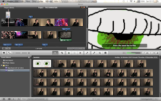
I wanted the effect of a 'blinking eye' to accentuate what he says about punk being gone in the blink of an eye. So I used a program called Animasher that allowed me to put several pictures together to create a moving image.


This is again going through the adding clips mechanism and deleting parts I don't need...


Within my trailer, I have attempted to pick out all the key things he has said to combine as one to try and entice the potential audience more.


This, I hope, will allow them to see just some of the things the full documentary covers, showing a diverse range of micro/macro-subjects to talk about when looking at The Damned, such as the Punk Era and the reaction of the public in the 70s and 80s.


I have chosen a quote to end the trailer on where he says "________" with a video of him taking a puff of his cigarette during the interview which ends with a perfect shadow on his nose which I hear is his most distinguishing feature for most!!


Sunday, 11 December 2011

The Perfect Ending!

I have found the perfect font for the ending credits, I feel. The font is called__________, and I love it because it is the exact font that is used in real productions for the endings. I feel this gives my trailer more verisimilitude.  I have done a screen shot of what it looks like below.


Friday, 9 December 2011

Continuing Editing

I have started looking at different sound effects and music I can add in. I really like the heartbeat sound effect and think it will create a good 'tenseness' whilst watching the trailer.


I wanted to find a way in which I could link the intro with the start of him talking so came up with the idea of a blank screen with the heartbeat, just to fill the gap. I feel this adds some suspense. You may also see that I have taken the writing away from when he speaks as I couldn't seem to be able to find the right balance of text to video.


Monday, 5 December 2011

IDEA #2

Ending

For my ending, I am going to use Harriet Trayling as it is not possible in the near future to see my friend Romy. It is going to be composed of her 'graffitying' a wall (she will be spraying onto one of my old white sheets) which will then be sped up. I then have come up with the idea of her going out of the shot, then coming back in near to the camera, quite fast, where she will push a piece of paper infront of the lens. I am hoping this will give a punk, almost scary feel, to it. The paper I will then edit in with the words 'out September 2012' with the fast sound effect, and then it will disappear.

After this I will then cut to a blank screen, and then write 'punk's not dead..' and flash 'YET' in big letters. This gives the impression that it is a trailer, and that it's going back to the era of punk.

I found this writing on dafont.com which I want to use because it suits my target audience and the genre of the trailer:


Thursday, 1 December 2011

Update (1)

My editing is going well and as to planned. As I am editing, I am coming up with new ideas for camera and the layout of my video. Here are some screenshots of what I have been up to:


My friend kindly gave me some of The Damned's songs, which I chose, to reflect my trailer. It was hard choosing the songs, but once I came across certain ones which you'll hear in the video, I was almost certain I would use them because they have the perfect 'edgyness' to them and provide a sense of excitement. 


Here I have looked at and used some of the footage of The Damned. Due to me not being around at that time, I had to do this. I provided the video with clips because I wanted to offer some verisimilitude to the events, and take my target audience back to that era.


As you can see, I have chosen two types of song in my video, with more to come. This is so my audience don't get bored whilst watching the trailer, and to keep them interested to show a change of mood.